9 Weeks Projects
1st 9 Weeks: Book Thief GIF and Country Road
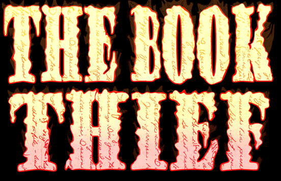
Steps to create this Book Thief GIF:
- Go online and find a picture of some kind of writing, whether is be from a historical document or a hand written letter, it doesn't matter. This will work best if the writing is clear and contains an interesting character. Make sure the image has a good revolution, around 1000x1000 or higher will suffice. Right-click and save this image to your documents.
- Open your Photoshop program. Go File>Open, and select this written document. From here we are going to create a clipping mask for these words. If needed, first crop the image. Then, turn the image on its side by Edit>Transform> Rotate 90 degrees CW or Rotate 90 degrees CCW. Then select the Text tool (the big T on the side bar), make a text books by clicking on the image, and type the words "The Book" in a large, bold font with black letters. Move the text book to the top half of the image, and click control + t (shortcut for Edit>Transform) and make the words bigger. Once you are happy with their appearance, select the Text tool again, make a text box, and type the word "Thief". Move the text box to the bottom half of the image, click control + t, and enlarge it. Try to make the letters fill up as much space as possible. If you want to make the letters wider, you can click on the Character tool (Capital A on the right side tool bar or Window>Character), and experiment the width or height of the letters by changing the percentages. Once this is completed, merge the two layers by clicking Layer, then scroll down on menu to Merge Visible. Next, go up create a new layer, fill it with black, by making black the background color (farther square) in the color palette, lower left corner and clicking control + backspace (shortcut for Edit>Fill). Put this layer underneath the text and writing layers. Place the writing layer about the text layer, and click Layer>Create Clipping Mask. At this point, the words should show through the letters on a black background.
- Put a Gradient Overlay (a shifting color scheme) on it by clicking Layer>Layer Style> Gradient Overlay. Add 5 different colors with the little arrows so that it shifts from red to dark orange to medium orange to light orange to orange-yellow to yellow smoothly. Lower the opacity to about 50% or enough so that the words are still clear and visible. Then put a Stroke on it by clicking Layer>Layer Styles>Stroke. Make it a red stroke and have it at a 3px size.
- At this point, make sure all layers are visible by looking to see if the eye next to each layer is clicked, and select Layer, scroll down and click Merge Visible, so that there is only one layer with brightly colored words made of writing, spelling out "The Book Thief", on a black background. Then make a copies of this layer, by clicking control + j.
- Leave the first layer as is. Use the Liquify tool (Filter>Liquify) to distort the letters to make it look like spikes or flames are coming out of them. For this first one, use a brush size of about 40 and a brush pressure of about 50. Only make small adjustments, so that the letters look as they are just starting to catch fire, and the flames are still small. When you are happy with your product, click okay and hit control + j again to make a copy of the letters which you have already liquified. On this second layer, use the liquify tool again to make the flames larger and more prominent. Increase the size of the brush and the brush pressure a bit to create a larger effect. Then, when you are once again content, hit control + j one more time on your latest flame layer, and use the liquify tool to make the fire as large as one would like. Again, increasing brush size and pressure can help you. For a realistic look, make sure all the flames are more or less pointing upward. If they are not, make the brush larger, about 80, and the pressure lower, about 30, and drag the mouse in one upward line on the side of the letters to change the direction of the flame tips.
- After the flames have been sufficiently created, put a Color Balance Layer (half white, half black circle on the bottom of the layer window on the lower right of the screen) on each of the flame layers. This gives the fire a reddish glow. Here are the numbers I used all layers: Midtones- Red +69, Magenta -52, Yellow-92; Shadows- Red+75, Green+29, Blue +72. I also but a Brightness/Contrast Layer at the top, also the half white/ half black circle, increasing the brightness, which gives the fire more of a glow.
- At this point, it is time to begin making the GIF. Click Window>Animation, and row for frames should appear at the bottom of the screen. The way to change what is in the these frames is to hide and unhide certain layers on the right side window. In the first layer, make visible only the first layer you used liquify on, where the fire is just beginning to catch, as well as its Color Balance Layer and the Brightness Layer at the top. Then, at the bottom, click the icon of the square with the corner folded up to add another frame. This frame will first appear identical to the last, however by hiding the first layer and unhiding the subsequent layer (in this case the middle fire layer), the contents of the frame change. Besides the middle flames layer, make visible also its Color Balance Layer and the Brightness Layer at the top. Repeat these steps for the final full fire layer. Then, wind the frames back down. Make another frame for the middle layer and then for the beginning fire layer. This will add to the smoothness of the GIF.
- One of the last steps is to tween, which adds extra transition frame to make the GIF more smooth. After each main frame (the ones we added in the step above) hit the tween button (the circles going in an upward diagonal line on the bottom of the screen, next to the New Frame button), and add from 3- 5 slides depending on preference. I added 5. Adjust the time of each from to 0.2 seconds by clicking on the downward arrow next to the amount of time at the bottom of each frame, and selecting that option in the pop-up menu that appears.
- Once you are content with the smoothness of your GIF, you must save it in a certain way, so you can upload it to the internet. Click File>Save for Web, and window should appear. Adjust the image size if the file is too big to upload, and click save. Finally, post it to your website or wherever you desire to share it!
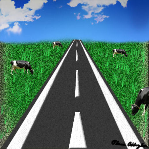
Steps to create this Country Road Scene:
- Open a document that is 400x400 pixels, and 100 pixels per inch. Fill the background with a light, but bright shade of green by selecting your shade in the color palette (lower left corner). Click on the farther square (background color), pick your color, press OK, and hit control + backspace (shortcut for Edit>Fill).
- Now, proceed to format this layer to look like Grass. Apply the Torn Edges Filter by clicking Filter>Sketch>Torn Edges. Set the settings at Image Balance- 50, Smoothness- 1, Contrast- 25.
- The next step is to apply a Gaussian blur of 3.8 by clicking Filter>Blur>Gaussian Blur
- Then, apply a dark green Inner Shadow by clicking Layer>Layer Styles>Inner Shadow. Set the settings at Opacity- 75%, Spread- 2%, Size- 4px, Range- 50%, Contour- 1st row, 6th column (wavy uphill slope)
- Once the Layer Styles window is open, you can just leave it open when applying the rest of the Layer Styles. Next is Outer Glow. Leave the color selection as the default color, which should be a very light yellow. Set the settings as Opacity-75%, Size- 43px, Range- 50%, Contour- 1st row, 6th column (wavy uphill slope).
- Apply an Inner Glow, put the settings at Opacity- 75%, Size- 43px, Range-50%. Leave the contour as the default, a straight, upward, diagonal line.
- Apply a Bevel and Emboss. Set the settings at Depth- 100%, Size- 5px, Gloss Contour- 2nd row, 6th column (two triangles or pyramids). Under Bevel and Emboss, there are two sub-styles called Contour and Pattern. For Contour, set the settings at Contour- 2nd row, 5th column (rounded steps, going up) with a Range- 50%. For Pattern, select any gray and white rock or marble pattern and set the Scale at 100%.
- Lastly, put a Gradient Overlay from White to Dark Green, with an Opacity of 100%. At this point, the entire layer should look like a patch of green grass. To make it a bit lighter, I also applied a Brightness/Contrast Layer by clicking on the half white/half black circle in the bottom right corner or the screen, in the Layer box, and increased the brightness.
- Next, you go online and find a picture of the sky of about a 1000x1000 resolution, and save it to your documents. Click File>Open, and open it in a different photoshop document. Crop it using the Crop tool on the left side bar, leaving the width but shortening the length. In other words, when finished, you should have a relatively short row of sky at the top of the screen. Minimize this screen, select the Move Tool, which is the first tool on the left-side tool bar and looks like a mouse, and drag this image into the grass document. Fit the sky onto the screen by clicking control + t (shortcut for Edit>Free Transform), and move it all the way to the top.
- Then, it is time to create the road. Make a new layer above the Grass layer but below the Sky layer, by clicking the Square button with the corner folded up at the bottom of the layer window. Using the Rectangular Marquee Tool (the button on the left-side tool bar with the dotted line making a square), create a rectangle stretching from the bottom of the document to the line where the land meets the sky, and make it take up about a third of the grass in the width. Place it right in the middle of the "field" and fill it with a gray color, by selecting gray as the background color in the color palette, and clicking control + backspace. Then, click control + t, to transform it. Holding down the control button while transforming allows you to skew, or move the corners in or out changing the shape of the box. Make the bottom wider and the top smaller, so it forms a trapezoid shape. It should start to look like an extending road. Then, apply a Pattern Overlay by clicking Layer>Layer Styles>Pattern Overlay. Select one of the mainly white Patterns that has small black dots because this makes the road look like asphalt. Decrease they opacity by a lot so the pattern is very subtle and the trapezoid retains its gray color.
- Now create another rectangle in a new layer stretching from the line where the sky meets the land all the way to the bottom of the document, except make this rectangle much thinner (for it is going to be the white lines painted on both sides of the road), and fill it will a white color. Click Control + t, and hold down control to skew this shape as well. Bring the corners of the top of the rectangle in, until the top almost disappears, while spreading the bottom corners of the shape out, to again make a trapezoid. When you are content with your line, click control+j to copy the layer, use the Move tool to move this second figure to the other side of the road, and flip it by clicking Edit>Transform>Flip Horizontally. Adjust the line so it lines up with the other side of the road by clicking control + t. When both lines are situated, apply the Pattern under the Bevel and Emboss to both layers. Click Layer>Layer Style>Bevel and Emboss. Unselect the Bevel and Emboss, and click underneath it on the Pattern. Select a pattern of mostly white with subtle black markings, such as dots or even a pattern. The goal is to make the lines look bit dirty, and therefore more realistic. Lower the opacity by a lot, so the effect is not too overwhelming.
- Use this same method but with smaller white rectangles to create the dotted line that divides a road into two lanes. Use about 4 to stretch from the bottom to the top of the road. Make it so that the top of one trapezoid is about same length as the bottom of the trapezoid directly above it. Therefore, the trapezoids get thinner and thinner along the stretch of the road. Also make the trapezoids shorter in height because it makes them look more proportional. Make sure to space them accordingly. Each of these trapezoids should be in a different layer. When they are suitably sized and placed, hide all the layers except for the middle of the road trapezoids that make up the line, and click Layer, scroll down, and click Merge Visible. Then apply the same Pattern under Bevel and Emboss as the side lines (explained above) to make them look worn.
- Next, to make the line between the sky and the land less severe, use the Smudge Tool, which looks like a hand is located on the left-side tool bar. Set the strength relatively low because you are not trying to make huge changes. Then, just click and drag in a path from the sky down word, extending a little over the barrier between sky and earth. This brings a small amount of relatively transparent blue sky over the grass and makes the two look less divided. However, make sure that the sky doesn't extend too far below. If it far below the road, it will look as if it wen behind the road, which is not a normal occurrence, so it would cause a strange appearance.
- Use the brushes (button looks like a paint brush and is on the left-side tool bar) that look like blades of grass. You can select them by clicking on the box in the upper left corner of the screen, under the Top tool bar, and scrolling down until you reach the brushes that look like blades of grass. Apply these in a light green color all over the grass. Select the light green color by clicking on the most forward square in the color palette (foreground color), choosing the shade of green that will best show up on the grass already there, and clicking OK. This creates a subtle effect. In other words, the grass isn't apparent but it still adds to the piece.
- Lastly, go on the internet, and find a high-resolution (1000x1000 or above) of a cow eating grass. Save it to your documents and open it in a different Photoshop document by clicking File>Open. Use the Pen Tool or the Magnetic Lasso(both located on the left-side tool bar), to trace around the outline of the cow; in other words, getting rid of the background. Use the Eraser tool (left-side window, the icon that looks like an eraser), to trace around the edges where you may have missed a couple spots and there is still a bit of grass. When finished, minimize this document, use the Move tool (1st tool on the left-side tool bar), and drag this picture onto the country road. Put these layers at the very top of the Layer window, above the road, grass, sky, and white lines. Transform the size of the cow by clicking control + t, and copy the layer making multiple cows. Use the Move tool to move the cows to different areas of grass. If you want to move a cow to the other side of the road and flip it, click Edit>Transform>Flip Horizontally.
- Finally, sign the document with your signature, created from a brush. Save the PSD file but also save it as a JPEG, and post this image, now in picture form to your website or any other place you like.
2nd 9 weeks Projects: Grainy Flower and Demonic Cat
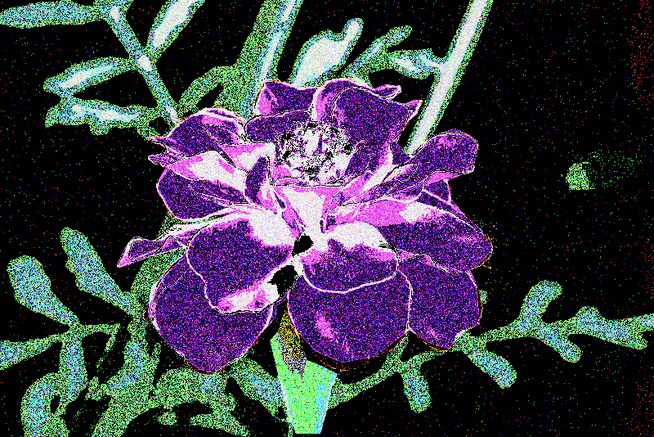
Steps to create this Grainy Flower piece:
- Find a picture containing flowers, in which there is one main flower in focus. If there are others in the background, that is fine. They will be covered up in later steps. Save it and open it in Photoshop. The first step is to click Image>Adjustments>Posterize, and set the magnitude to about 5.
- Next, use the Pen tool to to crete Path around just the flower, excluding any portion of stem, leaves, or background. Right-click, make the selection, and then press control + j to copy the selection into a new layer. Make three more copies of this layer Select the top of the three copies, click Image>Adjustments>Thresholds, and set the arrow somewhere on the right side, at about 200 or higher. In the second layer to the top of the the three copied layers, set the Threshold arrow somewhere in the middle, at about 120. And in the second from the bottom of the three layer, set the arrow some where on the write side, at about 75. Leave one layer on the bottom the same coloration. Next, for each of these layers, click Select>Color Range>Shadows, while the layer is visible. Click control + j to copy the shadows into their own layer. Hide all of the Threshold layers and unhide all of the Shadow layers. You then fill each of these Shadow layers in with a color by clicking Edit>Fill. I chose a dark purple for the top (#2a004f), a medium- light purple for the middle layer (#a955e3), and near white with a purplish hue for the bottom layer ( #ecd5ff).
- Go back to the originally colored-flower that was but out from the background but was not applied with Threshold. Use the Magic Selection tool o t go around that outline. Then, with the selection still present, click on the originally posterized layer. Right-click, and select Layer Via Cut. This should give you two new layers, one with just the flower and a color background of your background color, and the other layer should the Posterized background, with the flower shape cut from it. Move this new background just below the purple Layers. Above this background but below the flower, add a new layer. Fill it with black and change the Blending Mode to Overlay. Click on the background layer again, and click Image>Adjustments>Hue and Saturation. Leave the Hue and Lightness to same, but set the Saturation at -77.
- Merge all the layers containing parts of the purple flower into one layer (by clicking Layer>Merge Down twice). Copy this flower layer. On the higher, copied layer , click Image>Adjust>Vibrance, and set the Vibrance at +100 and the Saturation to +100. Then click Image>Adjustments> Brightness and Contrast, and set the Brightness at +150 and contrast -50. Set this layer's blending mode to Hue. Add a white layer at the very top, above the flower layers and all the other layers. Fill it in with white and set the Blending Mode to Overlay. Set the Opacity at 40%.
- Use the Pen tool to make a path around the supporting stem of the flower in the background layer (posterized with the flower shape cut out). Right-click, make selection, and click control + j to copy the selection into a new layer. Then move this stem layer just below the flower layer. Finally, merge all the layers containing some part of this flower scene into one by clicking Layers>Merge Visible. Then, apply the Grain filter to this newly created layer (in Filter Gallery). Set the settings as so: Intensity- 100, Contrast-100, Grain type- Soft.
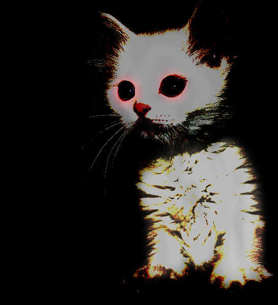
Steps to create the Demonic Cat:
- Find a picture of a cat on the internet (there are many), save it, and open it in Photoshop. It should be a photo in which the cat has his/her eyes mostly open, so that you can apply the demon eye effect. Use the Pen tool to make a path around the fur and whiskers of this cat. Take your time and try make the path to include some details of the fur. Once you are finished, right-click, make selection, and control + j to copy the selection into its own layer.
- Next, on the newly created layer with just the cat, we are going to apply the Dragan effect. Adjust the Levels (under Image>Adjustments) as follows: 50/1.00/240. Then, also under Adjustments, click on Hue/Saturation. Leave the Hue as is, but lower the saturations to about -57. Then, again under Image>Adjustments> Curves, play around a bit with the curves until the fur continues to look white but for the tips to have some darker color. I dropped three points in about these locations: (58,50), (117,175), (217, 221). The shape formed what could be described as a wavy uphill. Next, copy this cat layer, and apply Filter>Other>High Pass to this copied layer. I set the magnitude at 1.
- Add a new layer at the very top, above all the other layers. Fill it with black and set it's Blending Mode to Overlay. Next, adjust the Brightness of the main cat layer by clicking Image>Adjustments>Brightness and Contrast. Set the brightness at -150. Then, merge this main Dragan cat layer with the High Pass filter layer, so that they they are only one layer. On this layer, we will apply the spooky eyes effect. Click the circular Marquee tool, and use it to surround the iris of the cat's eye. Then click Select>Modify Feather, and set the magnitude at about 10. Have red as your background color and click control + backspace to fill with red. Then, click alt+backspace (control + backspace on a mac) to clear some of the coloring in the middle of the selection, and set the Blending Mode to Color Dodge. This should give the eyes a reddish hue. The next step is to make three copies of this layer, strengthening the spooky eye effect, and then merge all of the spooky eye layers into one. Copy this layer once more, and use the move tool to place it over the other eye, applying the effect to both eyes.
- Now, we are going to apply a Lens Flare to the eyes. First to know where to apply it, click on the top black layer and lower the opacity so that the cat is visible beneath. Use a small soft white brush to make two small dots on which you feel the lens flare would look good. I used the part fo the cat's eye that had the little shine there already. Increase the opacity back to normal, and click Filter>Render>Lens Flare. Set the settings as so: 105mm Prime, Brightness- 75%. and apply the Flatre on one of the dots. Repeat the process for the other dot.
- Click on the layer containing the cat that we have already worked with, and make a copy of that layer by clicking control + j. For the Brush tool, select a soft, low opacity, black brush, and increase the size until it encompasses the cat. Apply a couple of dark layers to this copied cat layer. Then, set the blending mode of this layer to Linear Burn. Add a Layer mask to this layer and using a much smaller, and even lighter opacity brush, go over the fur of the cat in the Layer Mask, but make sure not to go over the eyes. Next, click on the top black layer, and add a layer mask to that. Using a bit darker of a brush, go over the entire cat in this layer mask. Finally, beneath all of the visible layers, add a new layer and fill it with black.
